
Neuro-Design in 2026: How to Engineer "Dopamine" into Your UI
"Stop guessing why users bounce. We decode the science of Neuro-Design—using cognitive psychology and dopamine triggers to build interfaces that 'hook' users instantly (without using dark patterns)."
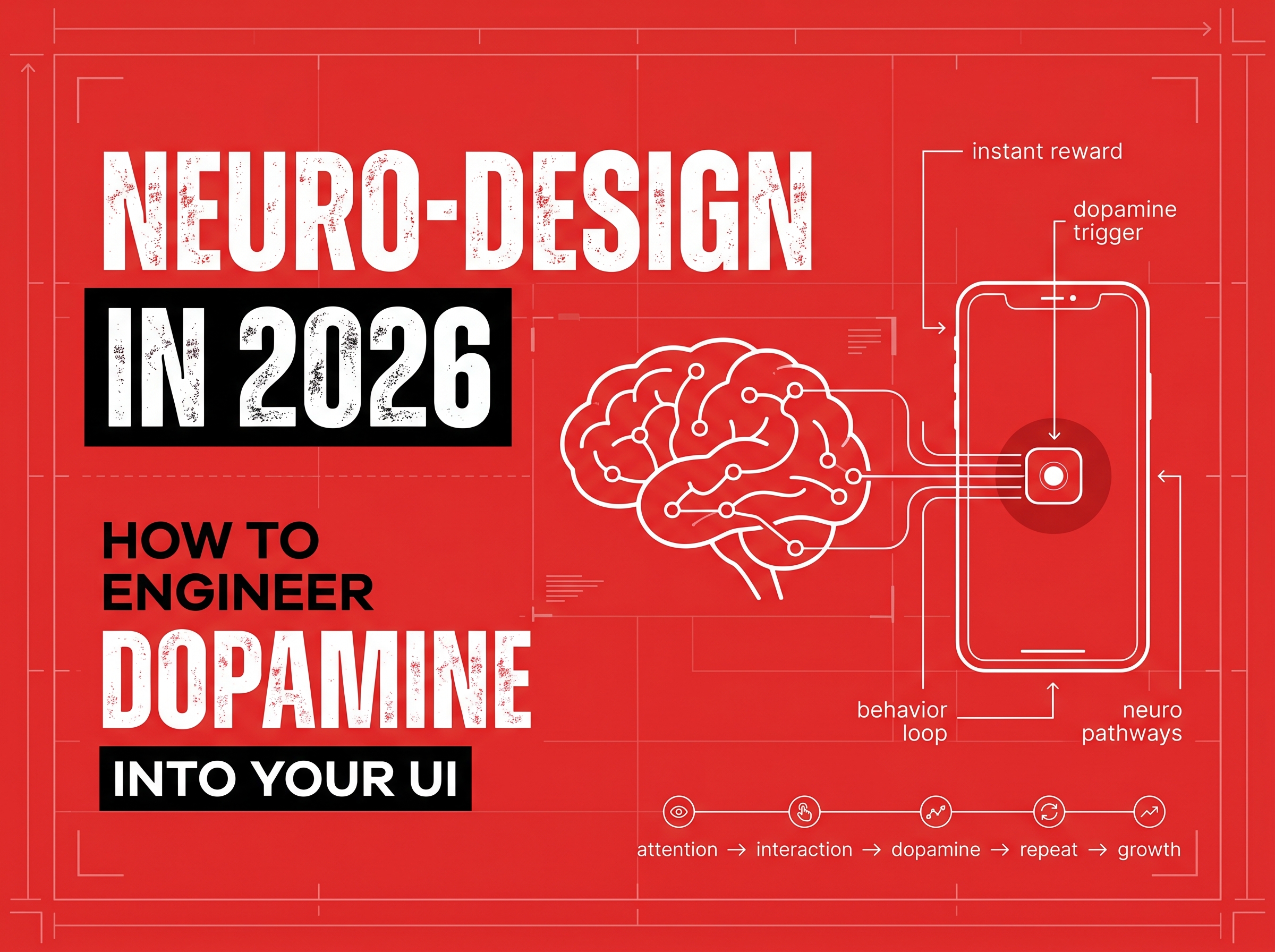
Neuro-Design in 2026: How to Engineer "Dopamine" into Your UI
Why do some apps feel "addictive" while others feel like a chore?
It isn't just about color palettes or pretty fonts. It’s about Neuro-Design.
In 2026, the best designers aren't just artists; they are behavioral psychologists. They understand that every scroll, click, and transition triggers a chemical reaction in the user's brain.
As attention spans drop to record lows (under 8 seconds), brands can no longer afford to design just for "aesthetics." You must design for Cognitive Load and Dopamine.
This guide explores how to ethically use neuroscience to spike your conversion rates—turning casual visitors into loyal power users.
1. Reduce "Cognitive Load" (Don't Make Me Think)
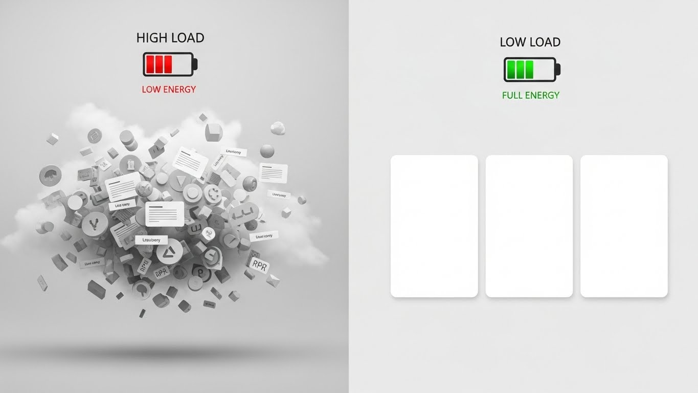
The human brain consumes 20% of the body's energy. It is evolutionarily wired to be lazy.
If your landing page has 12 different buttons, a carousel slider, and a pop-up all competing for attention, you are creating High Cognitive Load. The user’s brain perceives this as "work" and signals them to leave.
The Fix:
- Hick’s Law: The time it takes to make a decision increases with the number and complexity of choices.
- Action: Reduce your navigation menu to 4-5 key items. Have only one primary goal per screen. Use "Progressive Disclosure" (show information only when the user needs it).
2. The "Zeigarnik Effect" (Gamification)
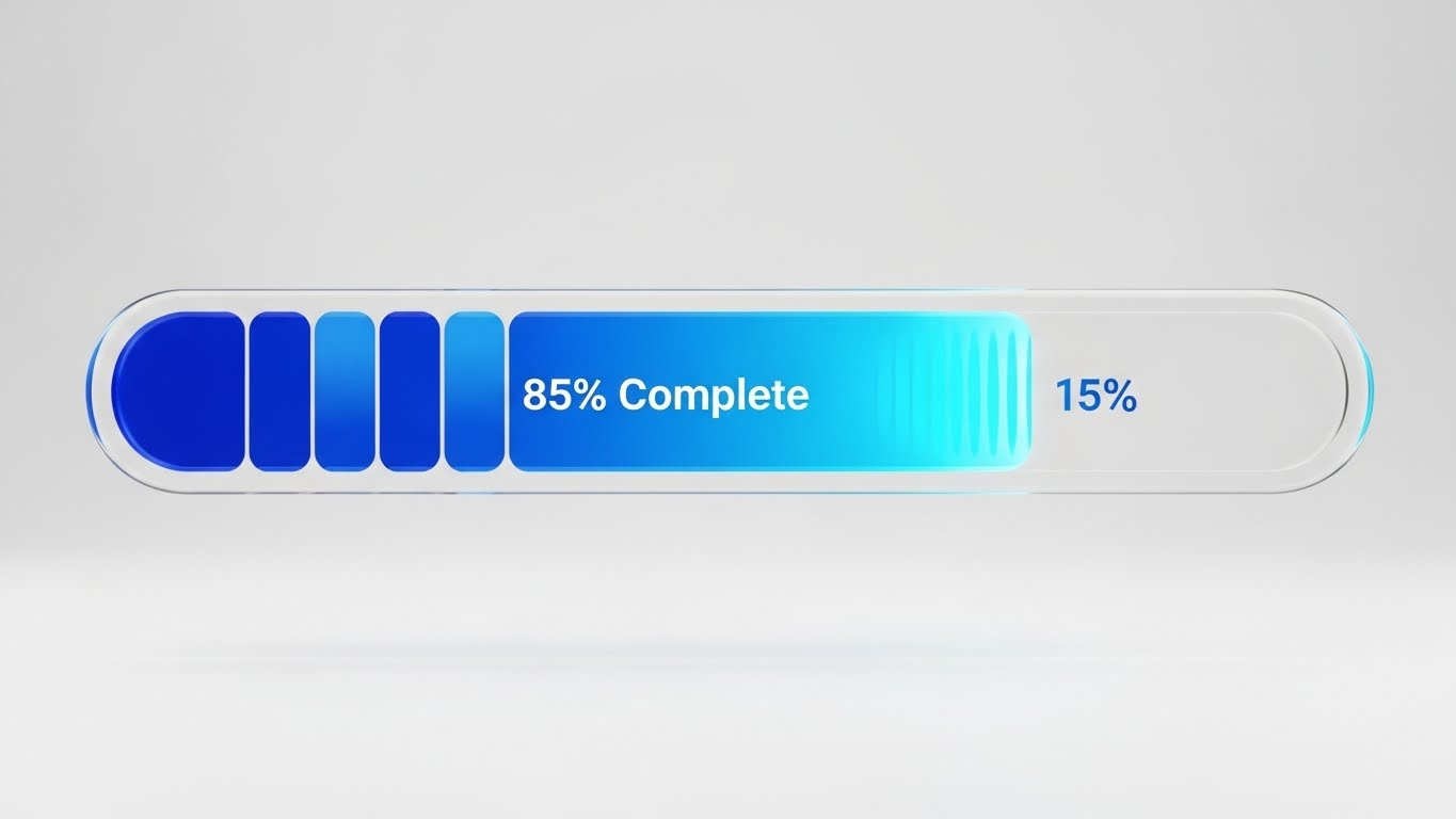
Have you ever noticed how LinkedIn shows you a progress bar saying "Your profile is 70% complete"?
That is the Zeigarnik Effect: The brain remembers incomplete tasks better than completed ones. It creates a "mental itch" that the user must scratch by finishing the task.
How to Use It:
- Onboarding: Never show a blank slate. Show a progress bar that is already 10% filled (the "Endowed Progress Effect").
- Checkout: clearly show "Step 2 of 3" to encourage completion.
3. Micro-Interactions: The "Feel" of Success
In 2026, "Motion Design" isn't just decoration; it's feedback.
When a user clicks "Pay Now," if nothing happens for 2 seconds, they feel anxiety. Did it work? Did I crash it? If the button instantly morphs into a green checkmark with a subtle haptic vibration, their brain receives a hit of Dopamine. They feel successful.
The Strategy: Don't just design the static state. Design the reaction.
- Hover states signal "I am clickable."
- Loading skeletons signal "Content is coming."
- Success animations signal "You did it."
4. The Fine Line: Persuasion vs. Dark Patterns
With great power comes great responsibility.
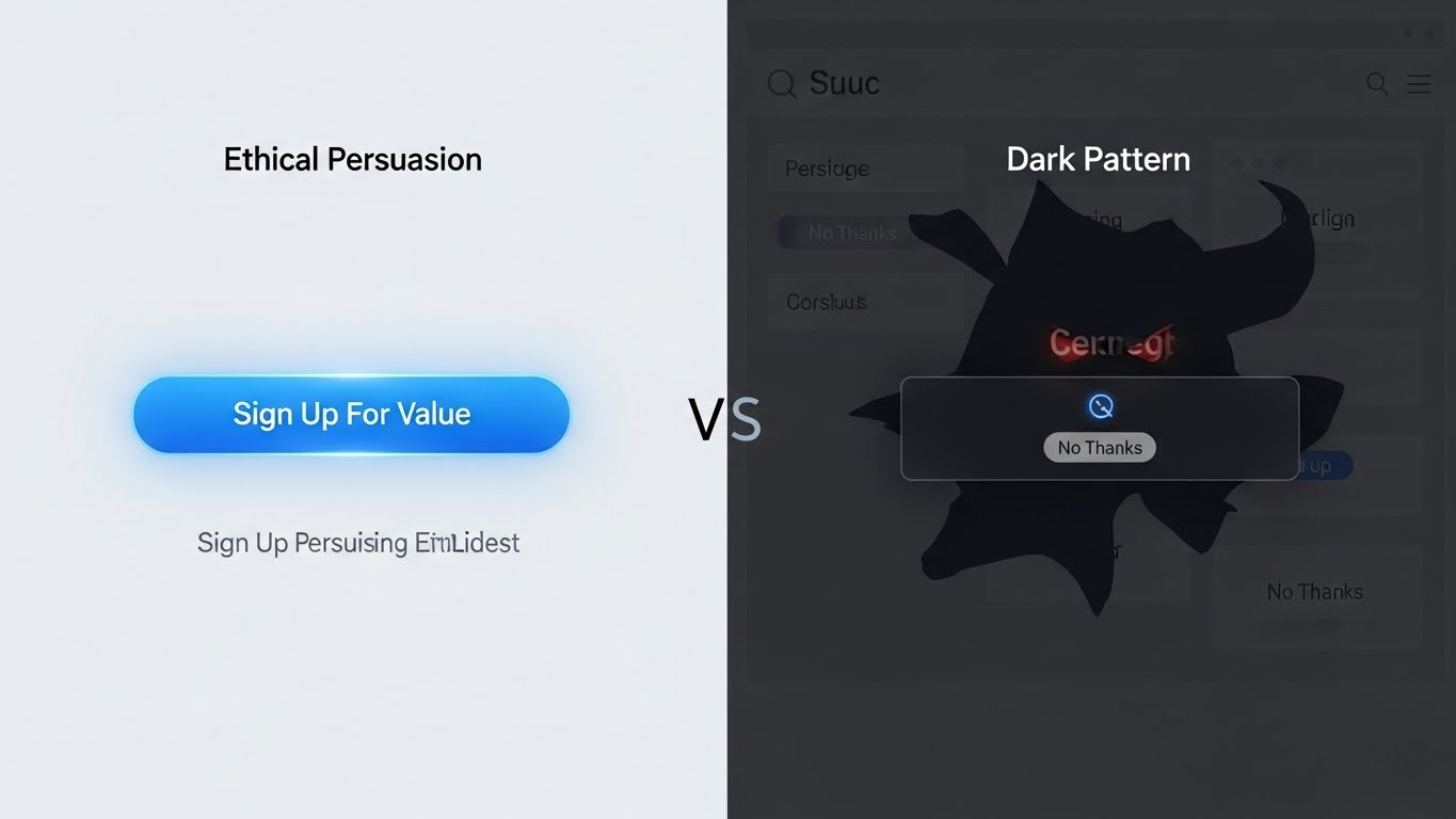
- Neuro-Design (Good): highlighting the "Best Value" plan to help users decide quickly.
- Dark Pattern (Bad): Making the "Unsubscribe" button invisible or adding a sneak item to the cart.
In 2026, users are savvy. If they sense they are being tricked, trust evaporates instantly. Use psychology to guide users to value, not to trap them.
How ROCKPAPER RUNWAY Designs for ROI
At ROCKPAPER RUNWAY, we don't just make things look expensive; we make them perform.
Our design process is rooted in data:
- UX Audit: We analyze your current site to find "Cognitive Friction" points where users are getting stuck.
- Conversion-First UI: We design interfaces using the Von Restorff Effect to ensure your "Buy" buttons are unmissable.
- Micro-Interaction Strategy: We build satisfying animations that reward user behavior, increasing retention.
- A/B Testing: We validate our designs with real traffic to prove they convert better.
Is your website beautiful but empty? Let’s give it a brain. Contact ROCKPAPER RUNWAY to audit your user experience and start designing for conversion.
Frequently Asked Questions (FAQ)
Q: What is Neuro-Design? A: Neuro-design is the application of neuroscience and psychology principles to User Interface (UI) design. It aims to create products that align with how the human brain naturally processes information.
Q: Is this different from standard UX? A: Standard UX focuses on "usability" (can I use it?). Neuro-design focuses on "persuasion" (do I want to use it?). It goes deeper into emotional triggers and behavioral economics.
Q: Does gamification really work for B2B? A: Yes. Even B2B buyers are humans. A progress bar during a complex software setup or a "celebration" animation when closing a deal makes the software feel more rewarding and less tedious.
Key Takeaways
- ✓Cognitive Load Theory: Users have a limited "mental battery." If your UI is too cluttered, their brain short-circuits, and they bounce.
- ✓The "Dopamine Loop": Micro-interactions (like a satisfying "ding" or animation upon checkout) release dopamine, training the brain to repeat the action.
- ✓Von Restorff Effect: The brain remembers "the odd one out." Use this to make your primary CTA button visually distinct from everything else.
- ✓Ethical Design: There is a fine line between "persuasion" and "manipulation" (Dark Patterns). We focus on the former.

Discussion
Be the first to start the conversation.
Leave a Comment