
The Evolution of Apple Design, Part 4
Explore Apple’s Depth Era (2019–2023), where flat design evolved with depth, blur, and motion. Learn how glassmorphism, transparency, and layered UX redefined digital interfaces.
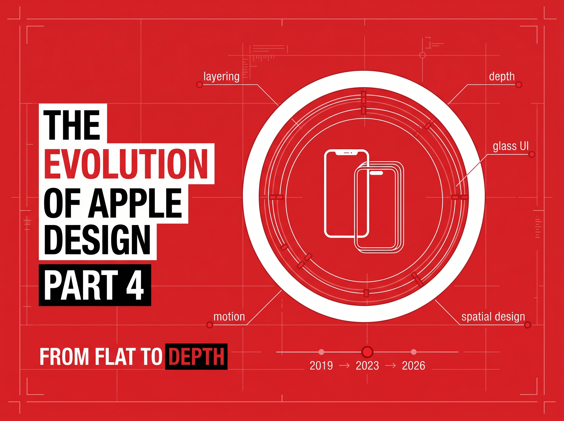
The Evolution of Apple Design, Part 4: The Depth Era (2019–2023) — When Flat Design Found Its Dimension Again
By 2019, digital design had become minimal — maybe too minimal.
Interfaces were efficient but emotionless, flat but lifeless.
Apple, once again, changed direction.
The new design language across macOS Big Sur, iOS 13+, and iPadOS brought depth, light, and movement back into play — marking the start of The Depth Era.
No longer purely flat or skeuomorphic, Apple created a living, breathing interface — translucent, layered, and responsive.
1. The Rise of Glassmorphism: Digital Transparency
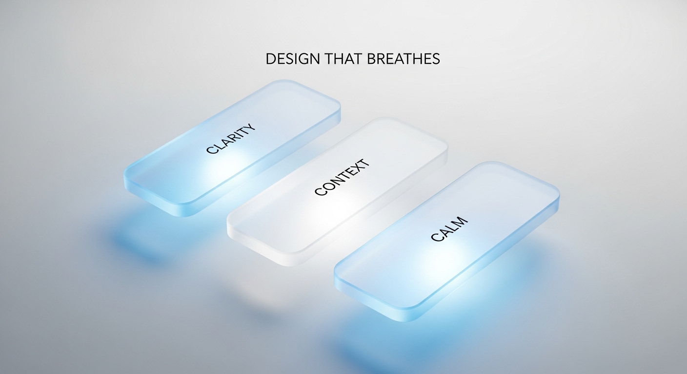
Apple’s shift began with translucency — blurs, reflections, and frosted layers that simulated glass-like depth.
This wasn’t realism; it was visual intelligence.
Key principles of glassmorphism:
- Transparency: Layers reveal hints of what’s behind them.
- Soft depth: Shadows separate elements subtly.
- Color diffusion: Gradients blend across surfaces for harmony.
- Dynamic context: Backgrounds respond to light and movement.
Apple wasn’t adding decoration — it was reintroducing spatial awareness.
Interfaces once again felt tactile, but with restraint and purpose.
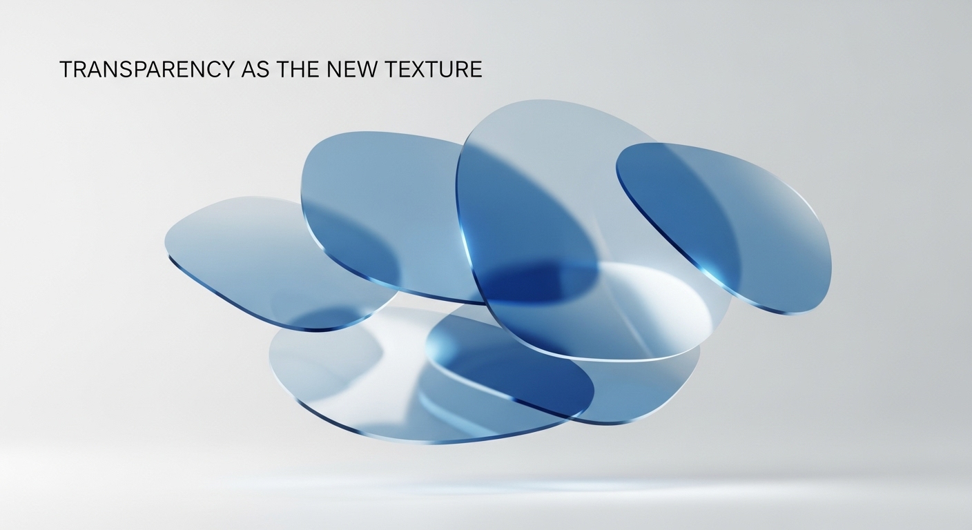
2. The Motion Language: Designing for Feeling, Not Just Function
Motion became Apple’s new texture.
Tiny animations, fluid transitions, and parallax effects gave the UI a sense of weight and continuity.
Example: Opening Control Center or navigating iPadOS multitasking — the way windows bend and layer creates the illusion of space.
These micro-motions replaced old shadows and gradients. They didn’t just look good — they felt alive.
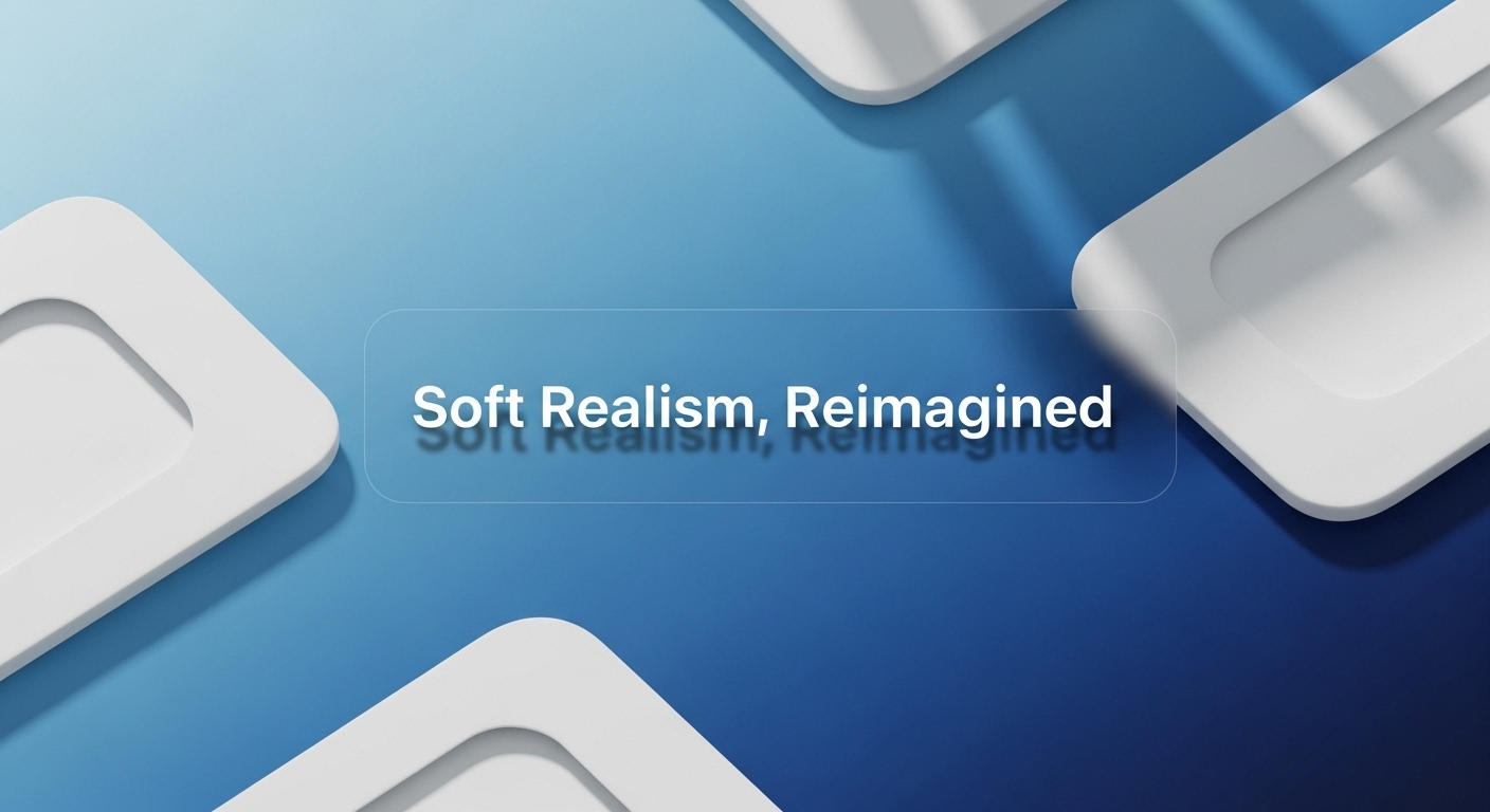
3. Neumorphism: The Brief Return of Soft Realism
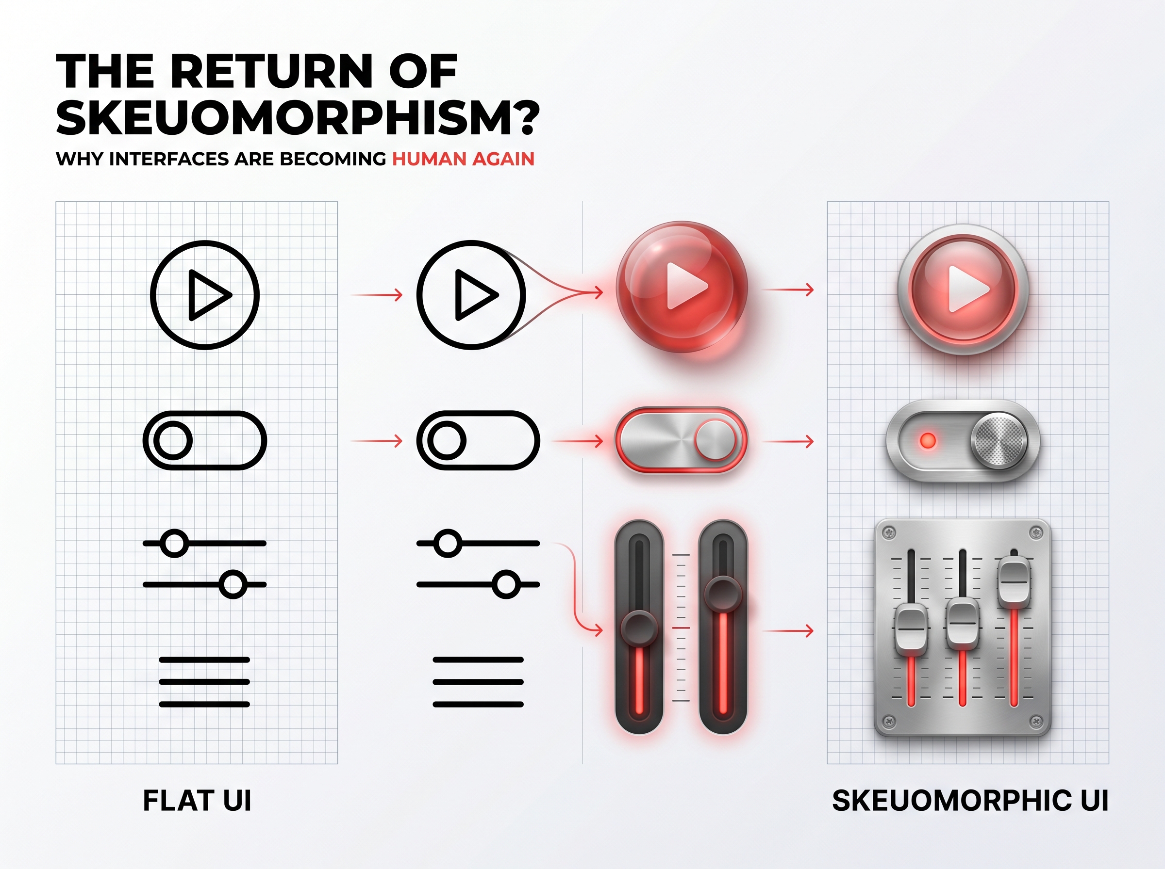
Between 2020 and 2021, designers experimented with neumorphism — a style using soft inner and outer shadows to simulate depth inside flat surfaces.
Though Apple never fully adopted neumorphism, its design DNA influenced countless apps, from calculator widgets to calendar interfaces.
The takeaway: Users crave dimension, but not distraction.
Neumorphism proved that tactile comfort still matters in a screen-first world.
4. Hardware Inspires Interface Again
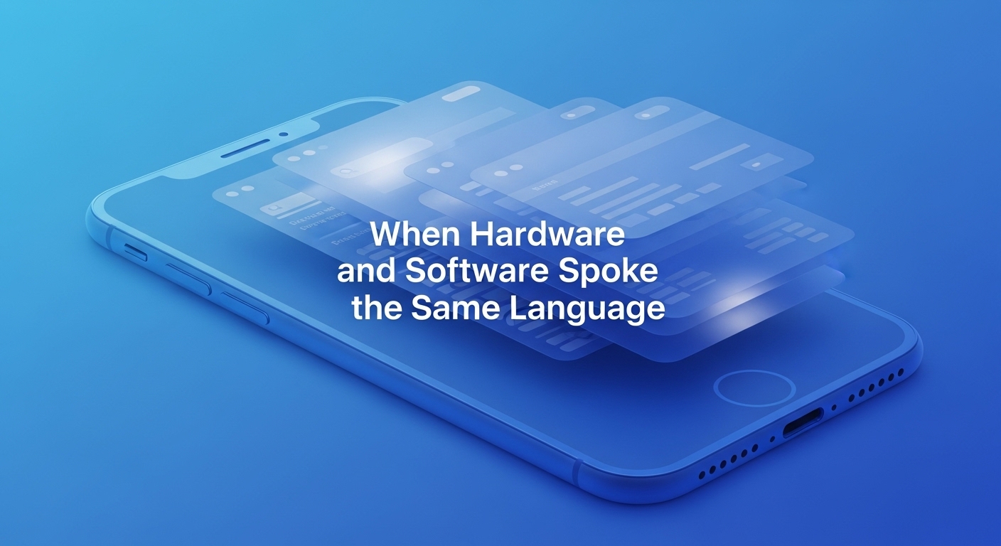
Apple’s hardware design language influenced software once more — clean edges, light gradients, and precision curves.
The hardware-software harmony became visible across devices:
- The iPhone 12’s flat edges mirrored macOS icon geometry.
- Big Sur’s icons gained soft shadows and dimensional color.
- The M1 chip era ushered in visual responsiveness and smooth animations.
Hardware wasn’t just a shell — it was a design ecosystem.
5. Accessibility Through Depth
One of Apple’s understated achievements: using depth to improve accessibility.
Subtle layering helped users distinguish focus states, modal layers, and context shifts.
Depth became not just an aesthetic choice — but a usability one.
Design principle: Depth creates hierarchy without clutter.
6. Design Lessons from the Depth Era
💡 Depth ≠ Decoration.
It provides context and hierarchy — not visual noise.
🧠 Motion teaches behavior.
Animation can guide attention more intuitively than icons.
🌫️ Transparency builds trust.
When users can “see through” the interface, it feels more open and real.
🔄 Physicality creates calm.
Soft gradients and spatial motion reduce cognitive load — a hallmark of Apple’s emotional UX.
7. From Depth to Dimensional Intelligence
By 2023, Apple was blending AI-driven UI adaptation into its depth systems — responsive contrast, real-time lighting, and adaptive interfaces.
The next frontier wasn’t more realism, but contextual intelligence — UI that changes based on environment, emotion, and intent.
This laid the foundation for Apple Vision Pro and its spatial operating system — where design literally surrounds the user.
Discussion
Be the first to start the conversation.
Leave a Comment