
The Evolution of Apple Design, Part 1
Explore how Apple’s early design philosophy—from the first Macintosh GUI to Jony Ive’s foundations—shaped the digital age. A look at Apple’s UI evolution through the eyes of design.
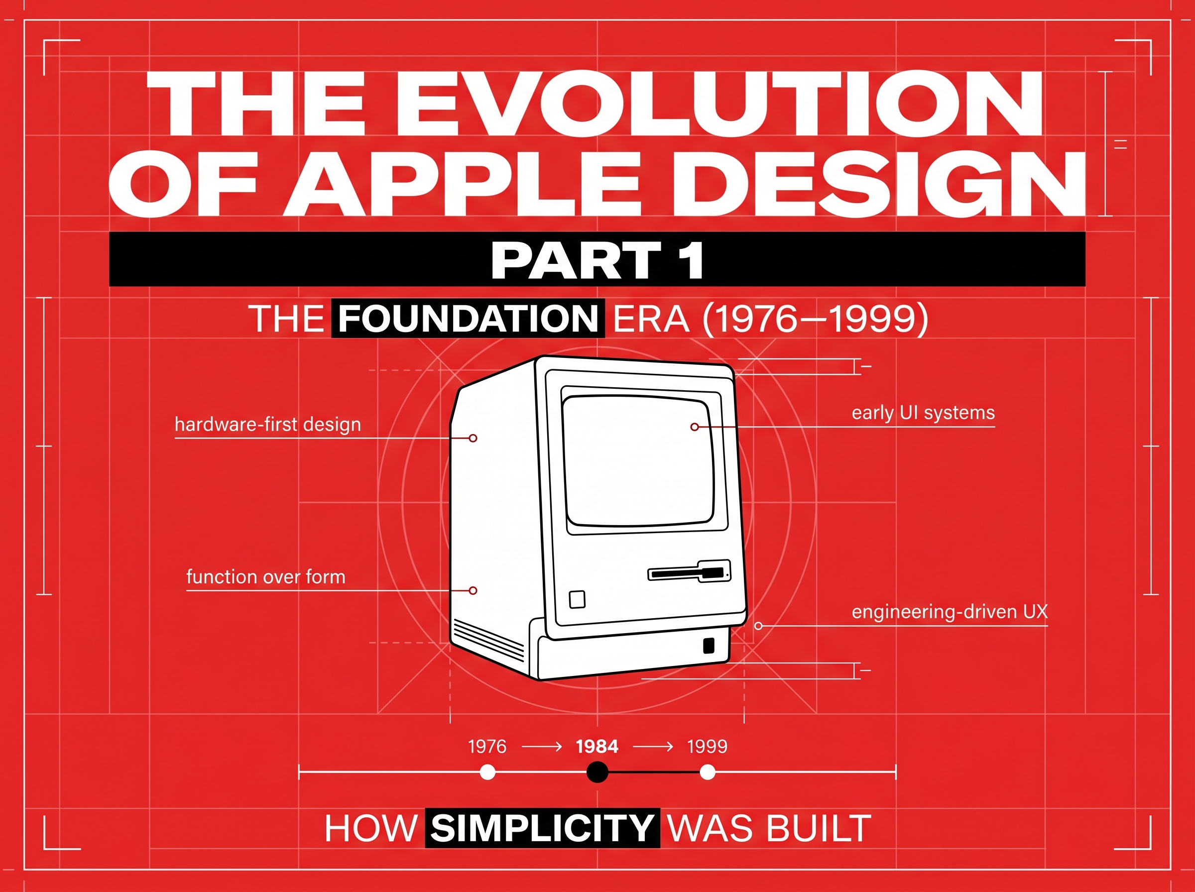
The Evolution of Apple Design, Part 1: Crafting Simplicity in a Complex World (1976–1999)
Before design became a buzzword, Apple treated it as a conversation between human and machine.
In 1976, when the Apple I debuted, its design wasn’t just visual—it was philosophical. It invited people to interact with technology, not just use it.
By the late ’90s, this philosophy had crystallized into Apple’s greatest differentiator: simplicity with purpose.
While other companies competed on features, Apple obsessed over feel.
1. The Roots of Human-Centered Design
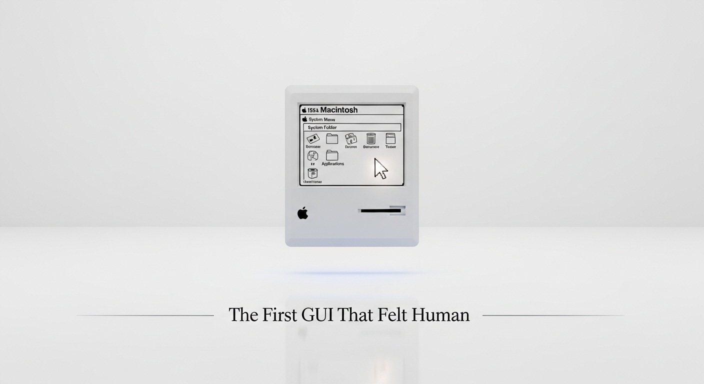
Long before the iPhone, Apple was already pioneering human interface design. The Macintosh (1984) introduced the world to a graphical interface that combined function and intuition: folders, icons, menus, and the mouse.
Every pixel was intentional. Every sound, tactile cue, and layout decision aimed to make computing emotional—not mechanical.
“The people who are crazy enough to think they can change the world are the ones who do.” — Apple’s 1997 Think Different campaign
Apple’s design language wasn’t just aesthetic—it was behavioral.
2. The Skeuomorphic Spark (Before It Had a Name)
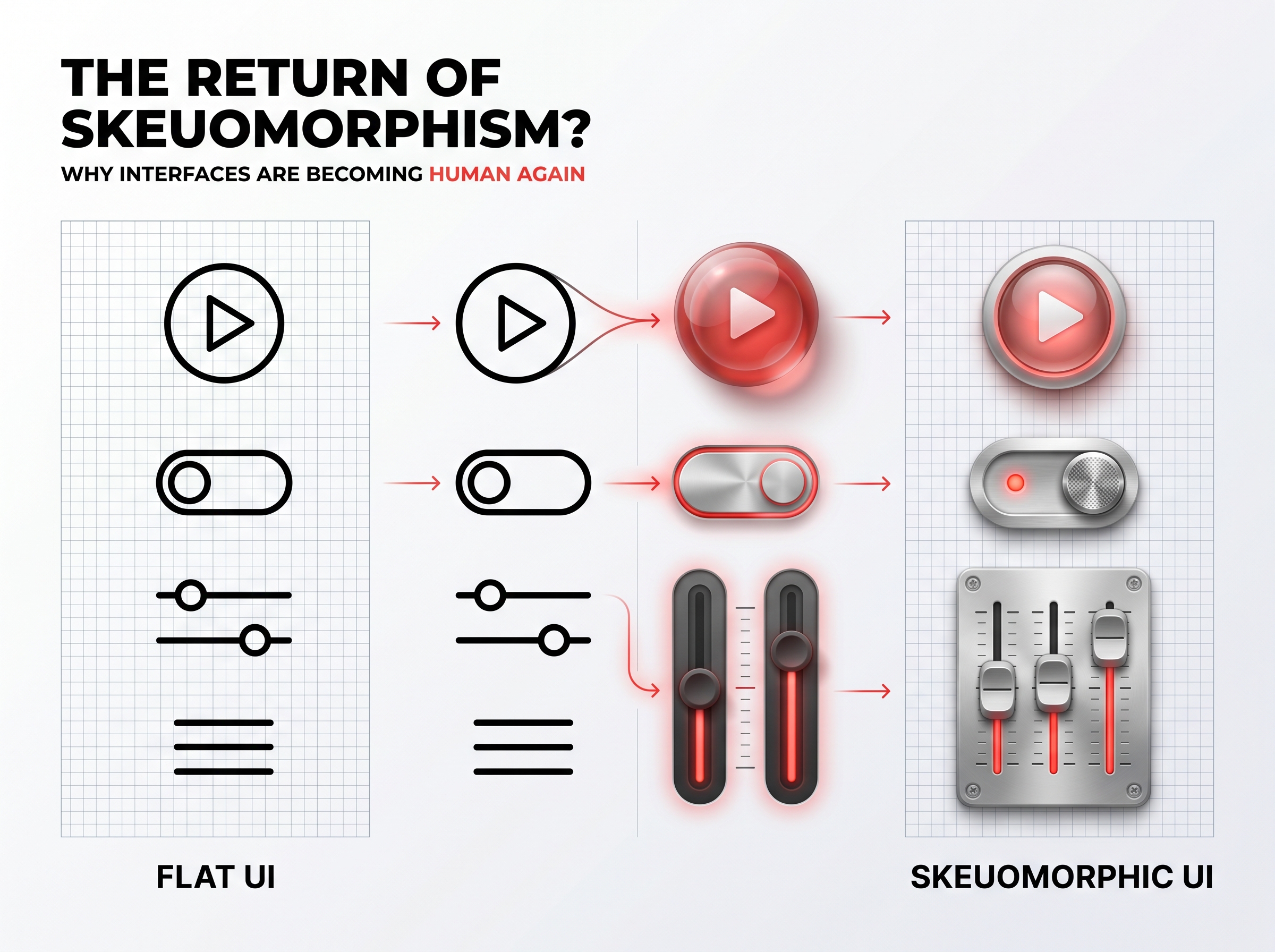
Though “skeuomorphism” became mainstream decades later, its essence existed in Apple’s earliest products.
The Macintosh Finder mimicked real-world objects—trash cans, file folders, desktops—to help users translate familiarity into usability.
Apple’s designers understood that comfort builds confidence. In a world new to digital interaction, skeuomorphism was a bridge between human instinct and digital logic.
3. The Birth of Brand Experience Through Design
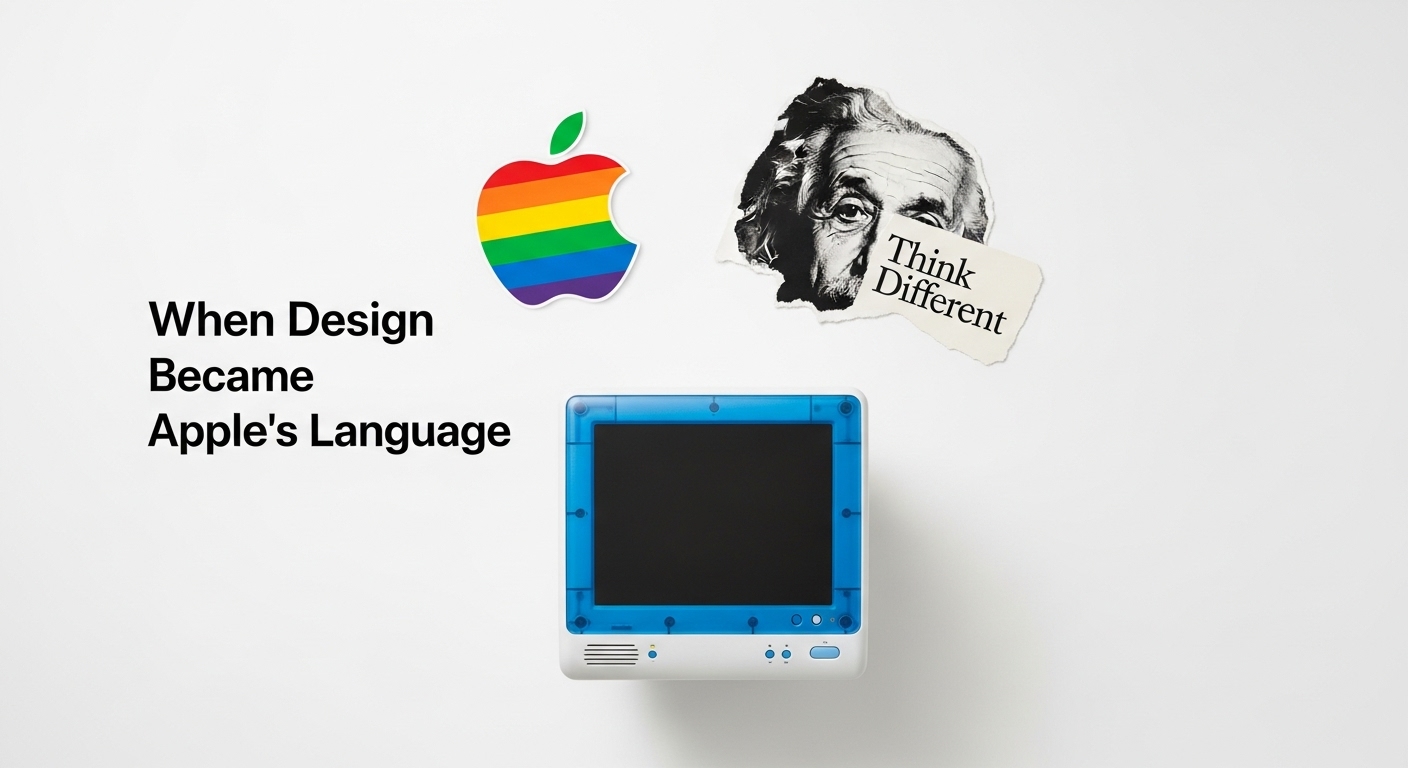
In the late ’80s and ’90s, design became Apple’s identity. The rainbow Apple logo, the translucent iMac G3, and Dieter Rams-inspired minimalism in hardware all communicated one truth: design is Apple’s language of trust.
Apple made design emotional—turning products into personality.
Even in its early GUIs, Apple embedded playfulness and empathy into systems once considered sterile.
4. From Function to Feeling: The Arrival of Ive’s Influence
By the late ’90s, a young Jony Ive began shaping Apple’s industrial and interface language.
He distilled decades of Apple design into one principle: remove everything that doesn’t serve clarity.
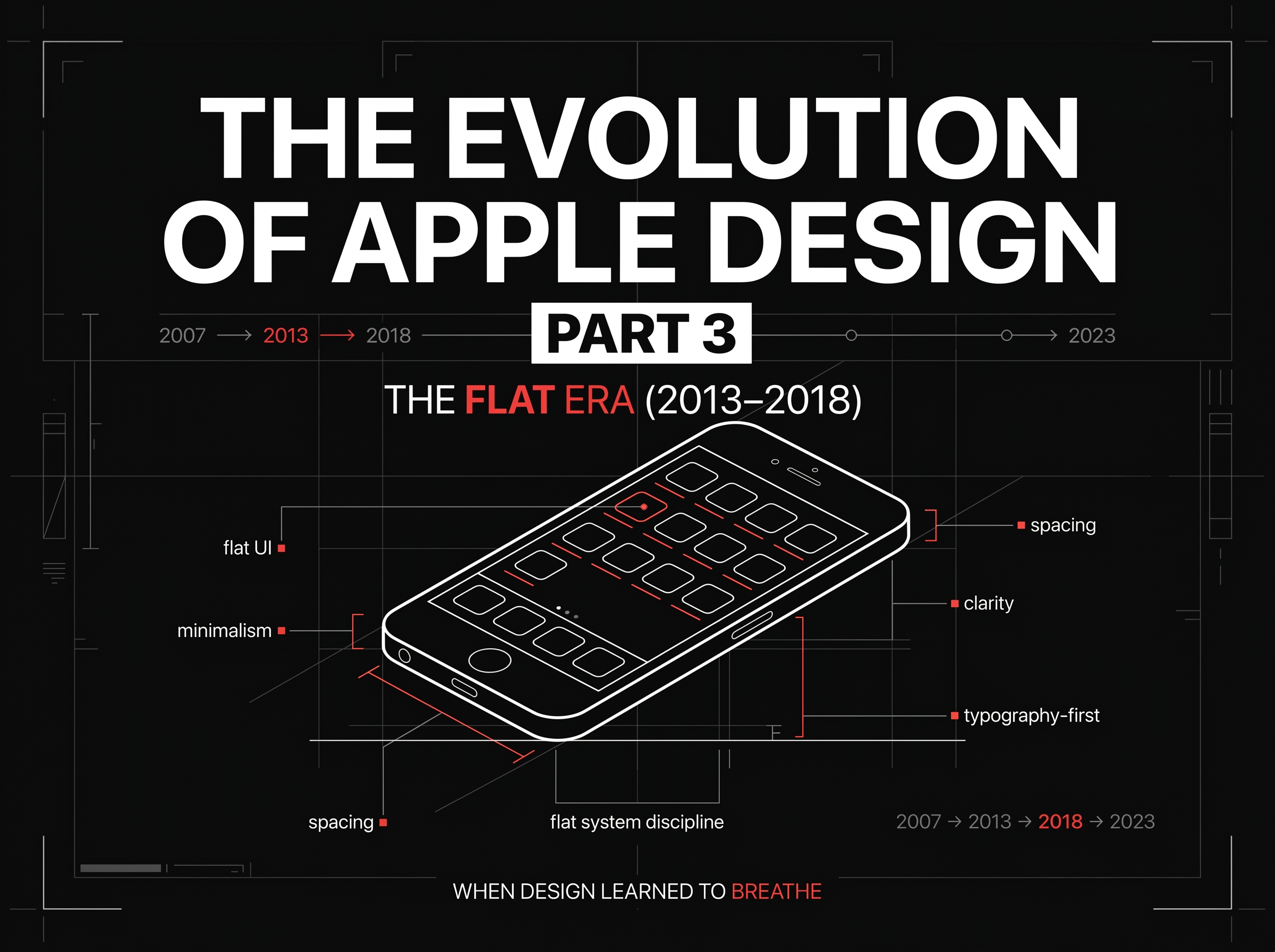
This mindset set the stage for the next design revolution—flat design, minimalist UI, and the birth of iOS aesthetics.
In essence, Apple’s early UI wasn’t about visuals—it was about values: clarity, empathy, and elegance.
5. Lessons from the First Era of Apple Design
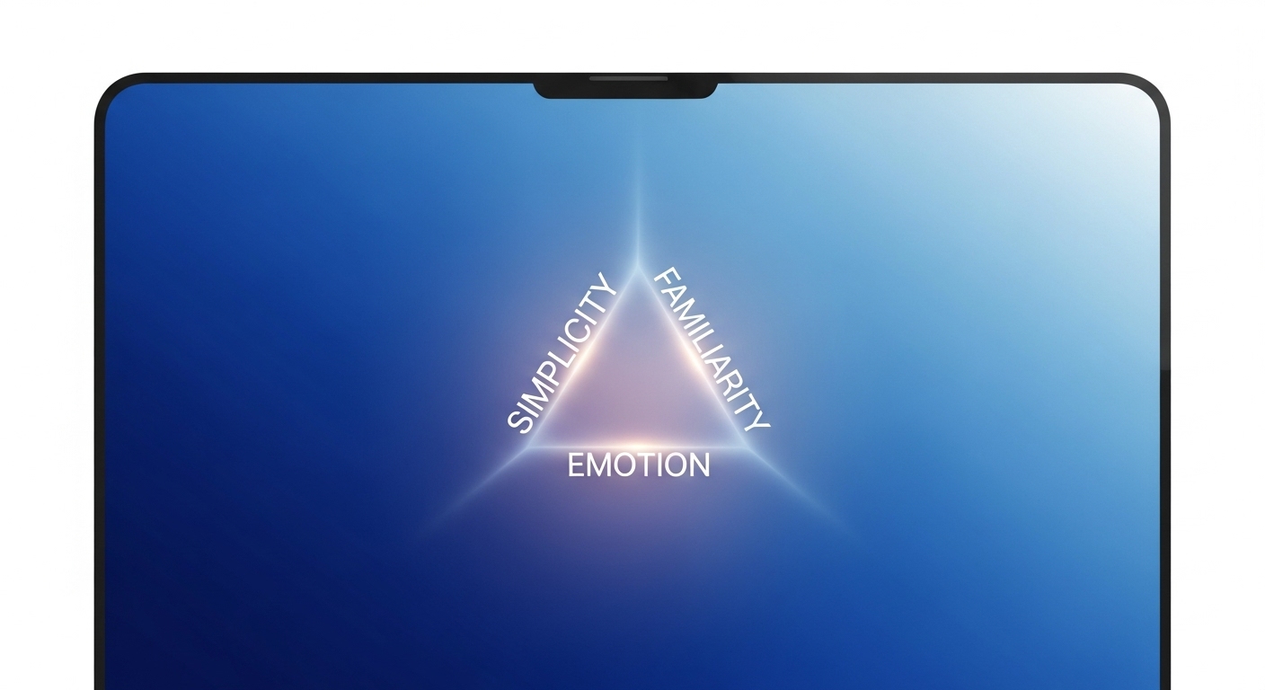
🎨 Simplicity builds trust.
The cleaner the interface, the faster users feel mastery.
🧠 Familiarity fuels adoption.
The use of real-world metaphors eased the digital learning curve.
❤️ Emotion drives loyalty.
Apple didn’t just make software usable—it made it loveable.
These lessons still guide Apple—and every modern design system that values user connection over complexity.
Key Takeaways
- ✓The Apple of 1976–1999 was more than a company—it was a design experiment in human empathy.
- ✓Every product, every pixel was built on a belief: that technology should feel less like code, and more like conversation.
- ✓At RockPaperRunway, we draw from Apple’s timeless design principles to craft experiences that feel natural, emotional, and adaptive—just as design should.
Discussion
Be the first to start the conversation.
Leave a Comment