
The Evolution of Apple Design, Part 2
Explore how Apple’s skeuomorphic era—from iTunes to early iOS—made digital interfaces feel human. Learn why realistic textures defined design from 2000 to 2012 and what it taught modern UX.
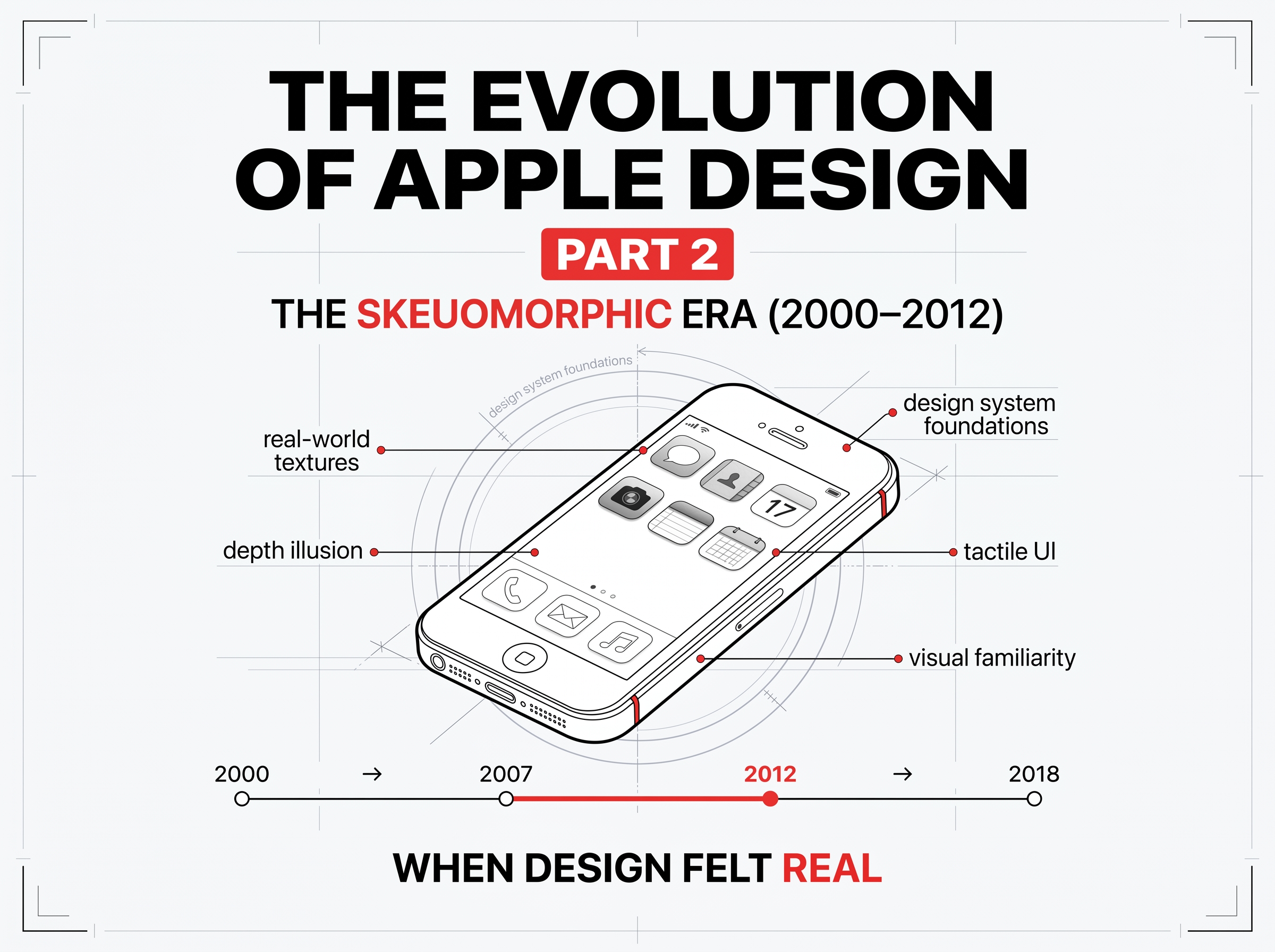
Part 2: The Skeuomorphic Era (2000–2012) — When Digital Design Felt Real
At the turn of the millennium, Apple turned pixels into materials.
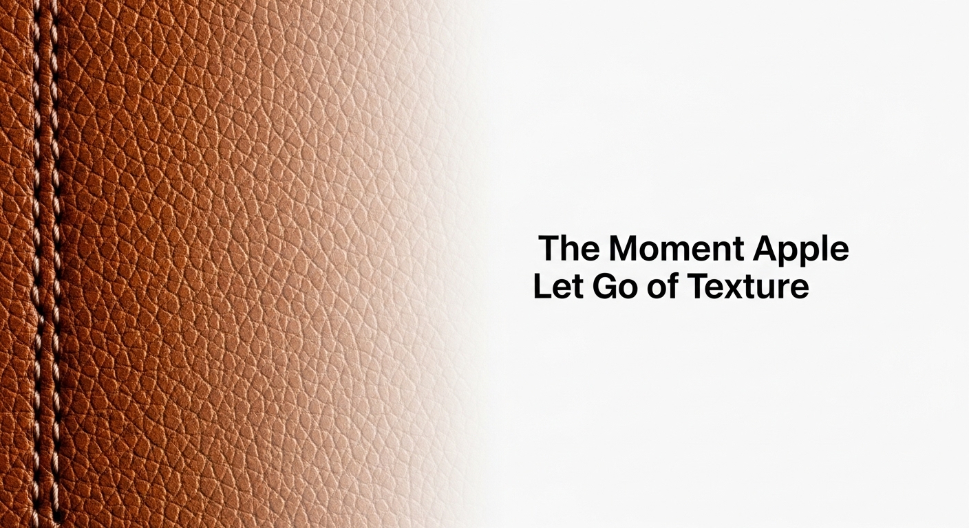
Wood grain calendars, brushed-metal browsers, stitched-leather notes, interfaces that didn’t just work, they felt.
This was the age of skeuomorphism, where digital design borrowed the language of the physical world to make new technology instantly familiar.
For more than a decade, Apple led that movement, teaching the world that the bridge between emotion and usability could be built out of texture.
1. What Is Skeuomorphism and Why It Worked
Skeuomorphism comes from the Greek skeuos (container) + morphē (form): designing digital objects that look and behave like real ones.
Why Apple used it:
- 💡 Familiarity: A calendar that looked like leather felt trustworthy.
- 🎯 Learnability: Users intuitively understood buttons, switches, and dials.
- ❤️ Emotion: Texture created warmth in a world of cold glass screens.
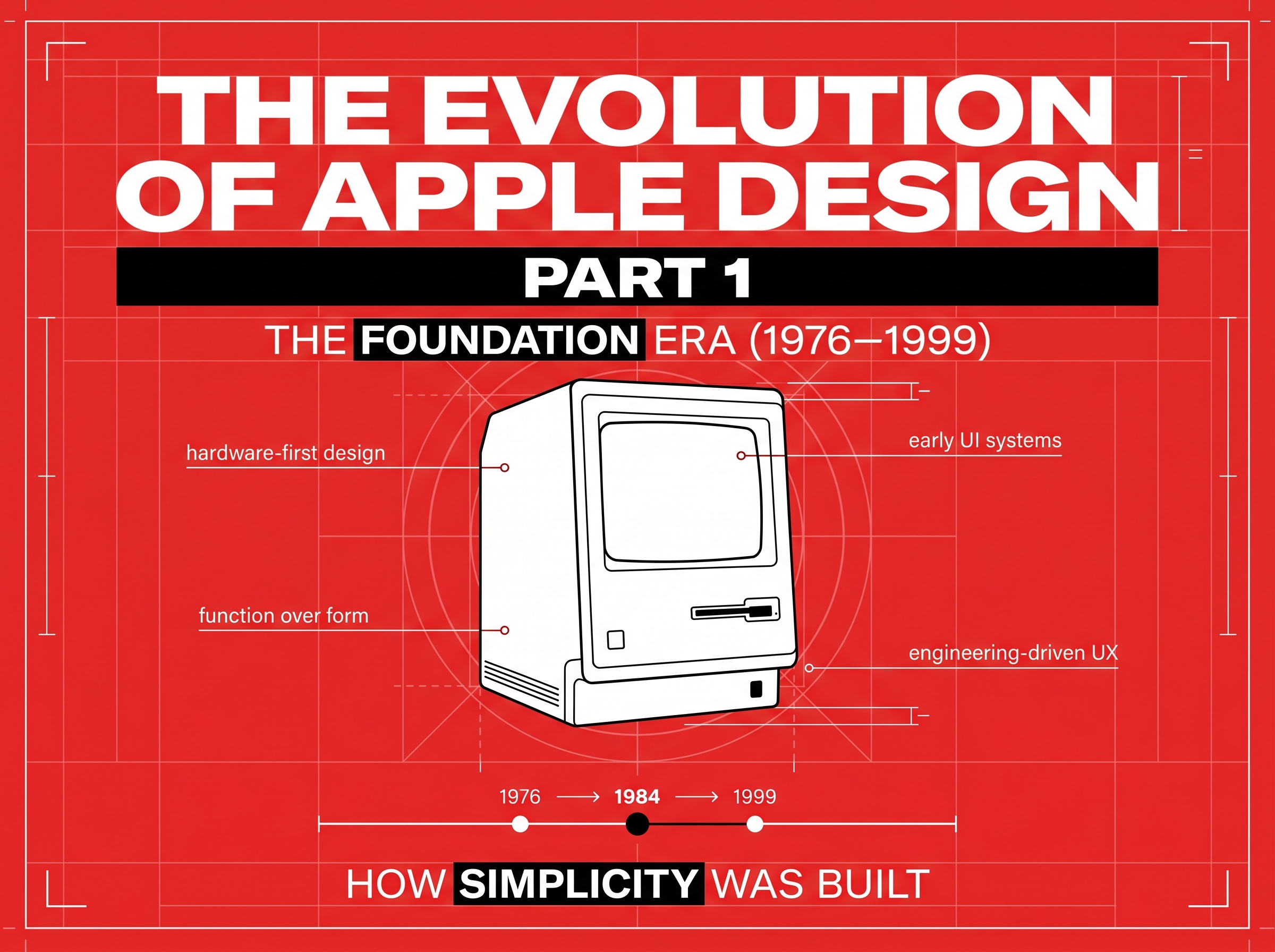
Under Steve Jobs, Apple’s design mandate was clear — make technology humane.
2. The Visual Language of Realism
Apple’s software of the 2000s embodied craft:
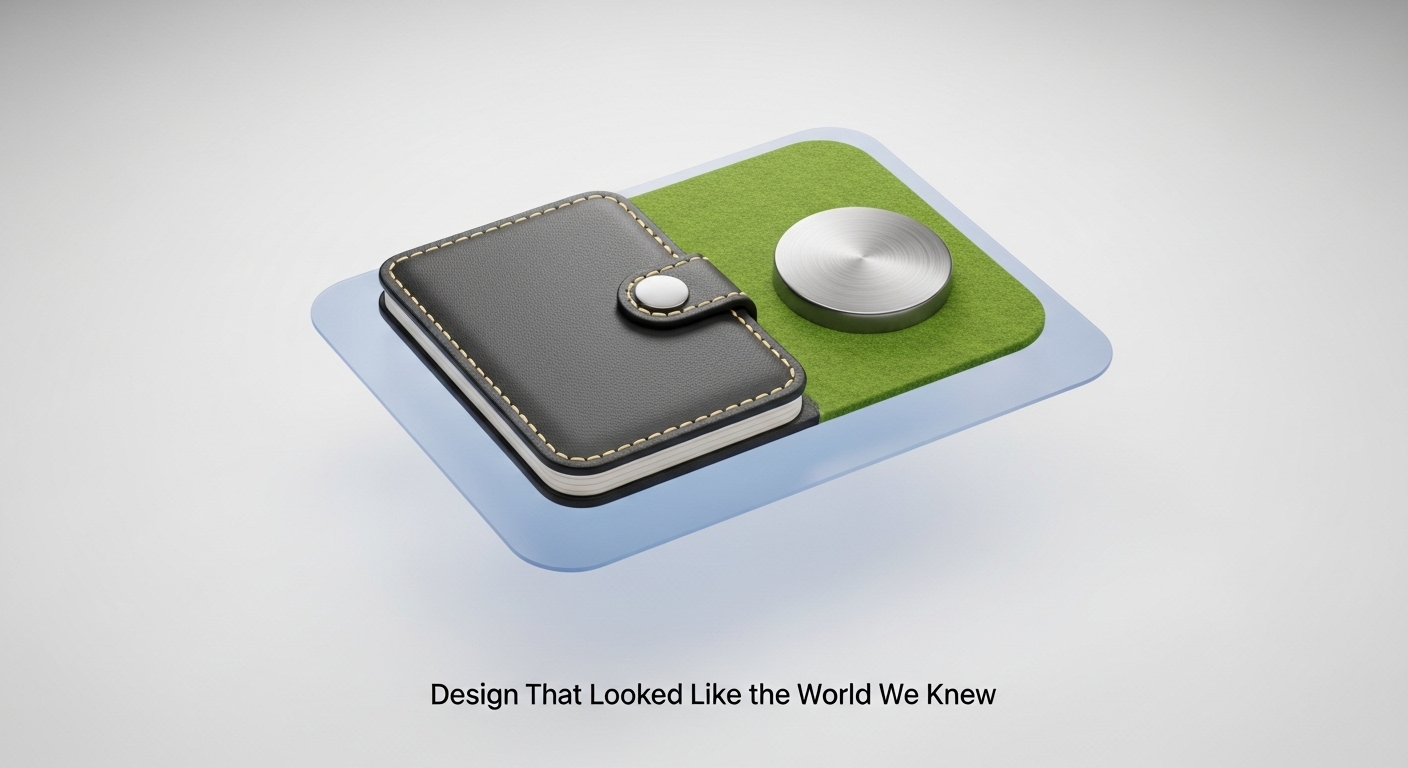
- iTunes (2001): Brushed aluminum and 3D buttons.
- iCal & Notes: Leather stitching and paper grain.
- Game Center: Green felt tables like a casino lounge.
Each visual cue told users: you already know how this works.
Skeuomorphism wasn’t kitsch; it was empathy expressed through pixels.
3. The Influence of Hardware and Craft
Jony Ive’s industrial design and the Human Interface team worked in tandem.
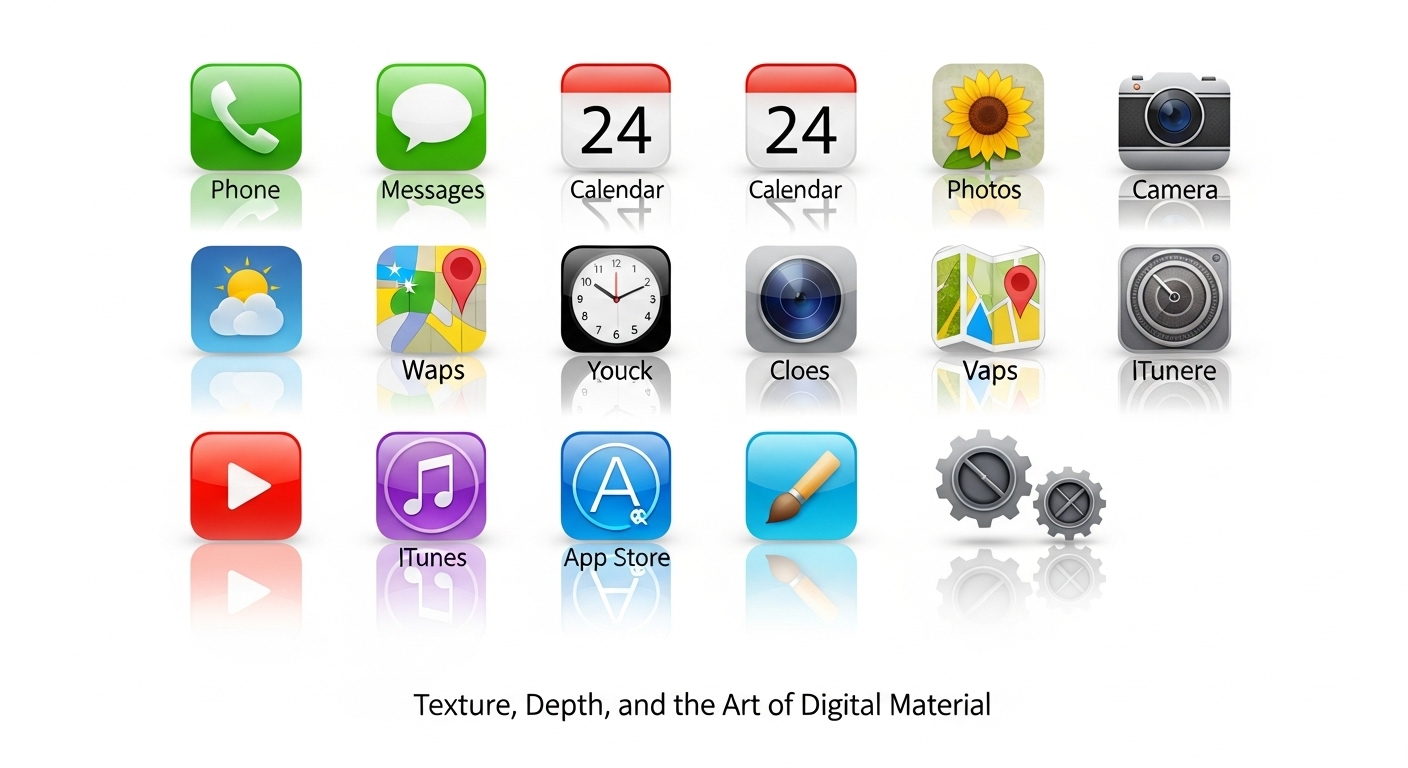
The gleam of the iPod’s scroll wheel and the gloss of iOS icons shared the same DNA — precision, tactility, emotion.
Apple’s goal: make digital touch feel physical.
Every highlight and shadow was tuned to trigger the same satisfaction as pressing a real button.
4. Steve Jobs and Design as Storytelling
Jobs believed design wasn’t decoration — it was narrative.
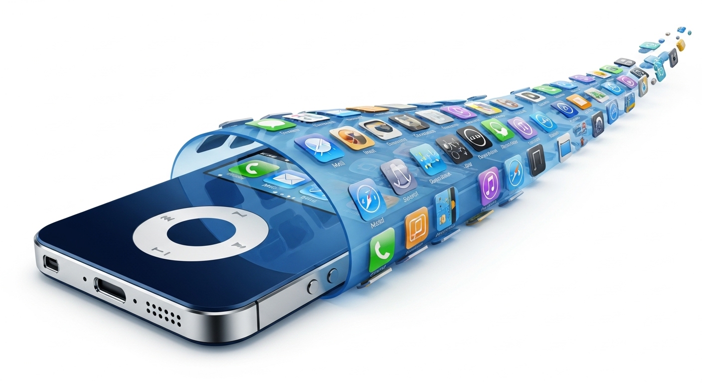
Each app icon told a story: paper, leather, steel.
He saw realism as comfort — a way to make the future less intimidating.
While critics later mocked it as over-designed, skeuomorphism gave digital design its first soul.
5. The Turning Point: When Realism Met Minimalism
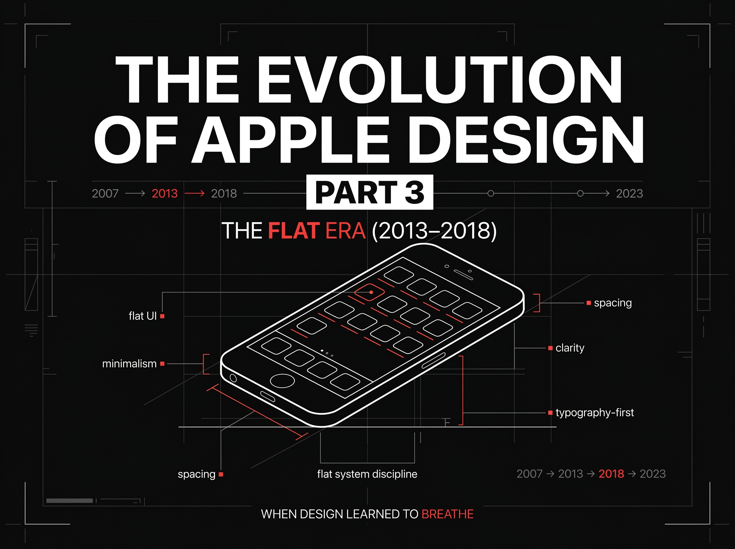
By 2012, the world changed. Retina displays, flat branding, and responsive web design demanded clarity.
Textures became weighty. Interfaces felt dated.
Apple began stripping away shadows and stitches — preparing for the Flat Revolution that would arrive with iOS 7.
But the lessons of the skeuomorphic era endured:
Empathy first. Form follows feeling.
6. Design Lessons from Apple’s Skeuomorphic Era
🎨 Texture teaches. Visual realism helps users learn new patterns.
🧭 Emotion guides interaction. Feeling drives engagement more than logic.
🧩 Design is translation. The best interfaces make complex tech feel human.
These principles became the scaffolding for every design trend that followed — flat, neumorphic, or adaptive.
Key Takeaways
- ✓Between 2000 and 2012, Apple’s skeuomorphic phase defined a generation of visual design.
- ✓It gave digital interfaces warmth, trust, and emotional resonance — proof that beauty could be functional.
- ✓At RockPaperRunway, we carry that same ethos forward — crafting AI-driven interfaces that retain the emotion, clarity, and purpose that once made Apple’s pixels feel alive.
Discussion
Be the first to start the conversation.
Leave a Comment