
Why This Layout is Everywhere - The Rise of Bento Grids:
"Bento Grids" are dominating modern web design for one reason: they solve the mobile responsiveness problem while looking premium. Learn why brands like Apple use them and how we used this layout to boost engagement for a food industry client.
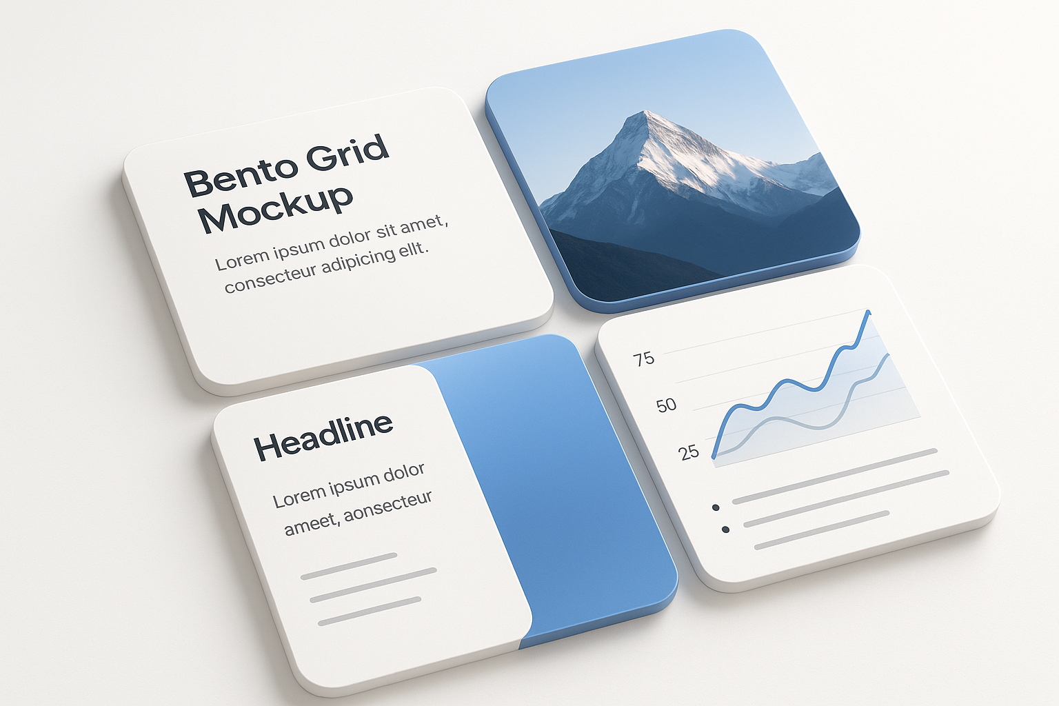
The Rise of Bento Grids, Why This Layout is Everywhere?
If you have visited an Apple product page or a SaaS dashboard recently, you have seen the "Bento Grid."
It isn't just a trend; it is a functional evolution of web design. Inspired by the Japanese bento box, this layout organizes complex information into modular, rectangular blocks. It is the single best way to display high-density content on small mobile screens without overwhelming the user.
Here is why this layout works and how we use it to fix cluttered client websites.
What is a Bento Grid?
A bento grid is a layout system that divides content into modular, strictly defined boxes. Unlike a traditional list or standard column layout, a Bento Grid allows for "visual hierarchy"—you can make the most important feature the biggest box, while secondary details sit in smaller boxes around it.
Why Are Bento Grids Trending? (It’s Not Just Aesthetics)
Designers aren't just using them because they look cool. They use them because they solve User Experience (UX) problems:
- Mobile Optimization: The grid stacks perfectly. On a desktop, it looks like a dashboard; on a mobile, the boxes simply rearrange into a single vertical column. No re-design needed.
- Scannability: Users don't read websites; they scan them. A Bento Grid forces content into small, digestible chunks, stopping the user from skimming past important info.
- Flexibility: It can hold anything. One box can be a video, the next a static image, and the third a text block.
Who Uses Bento Grids Today?
- Apple: Uses them for "Feature Highlights" (e.g., Battery life, Camera specs).
- Notion: Organizes templates and workspace options.
- Airbnb: Categorizes destinations visually.
Agency Case Study: The "Food Industry" Fix
We don't just admire this trend; we use it to solve engagement problems.
The Client: A Food Industry brand. The Problem: Their "Health Benefits" and "How it Works" sections were traditional bulleted lists. Users were scrolling past them immediately, missing the core value of the product. The page was boring and text-heavy.
The Bento Solution: We redesigned these specific sections using a Bento Grid.
- Box 1 (Large): High-quality video of the food preparation.
- Box 2 & 3 (Medium): Key nutritional stats (e.g., "Zero Sugar").
- Box 4 (Small): A quick testimonial.
The Result: Engagement time on the page increased significantly. Because the content was broken into visual "snacks" rather than a wall of text, users actually stopped to look. They understood the product's value proposition faster because the design guided their eye through the grid.
How Can You Use Bento Grids?
Do not use them for your entire website (that looks chaotic). Use them for specific, high-information sections:
- Feature Lists: Instead of bullet points, give every feature a "card."
- Portfolios: Show off case studies with different sized images.
- Social Proof: Mix tweets, reviews, and star ratings into a grid.
What to Watch Out For
- Over-cluttering: If you put too much text inside a small box, it becomes unreadable. Keep copy short.
- Hierarchy issues: If all boxes are the same size, the user doesn't know where to look. Make the most important element the largest.
FAQ
Q: What is a bento grid layout? A: It is a modular design system inspired by Japanese lunch boxes, dividing content into distinct, rectangular compartments to organize complex info clearly.
Q: Why is it better for mobile? A: Bento grids are naturally responsive. The blocks stack vertically on mobile phones without breaking the design or requiring complex coding fixes.
Q: Can I use it for any website? A: It works best for tech, portfolio, and product-focused sites. It is less effective for long-form blogs or news sites that require linear reading.
Pro Tip
💡 At ROCKPAPER RUNWAY, we design conversion-focused websites and eCommerce experiences using trends like bento grids to improve engagement and guide user flow. From product showcases to feature highlights, our designs blend style and performance.
Key Takeaways
- ✓Bento grids are not just a stylistic choice; they are a retention strategy. By breaking complex information (like benefits or features) into modular blocks, you force the user to pay attention to each element. As we saw with our food industry client, switching from lists to grids can directly increase the time potential customers spend engaging with your brand.
- ✓💡 At ROCKPAPER RUNWAY, we don't just follow trends—we use them to drive engagement. We craft Bento Grid layouts that turn boring "feature lists" into high-converting visual stories.
Discussion
Be the first to start the conversation.
Leave a Comment